The Wikimedia fundraising team relies on A/B testing to increase the efficiency of our fundraising banners. We raise millions of dollars to cover the expense of serving Wikipedia and the other Wikimedia sites. We don’t want to run fundraising banners all year round, we want to run them for as few days as possible. Testing has allowed us to dramatically cut the number of days of banners each year — from 50 to about nine.
We’re in the middle of reevaluating the statistics methods we use to interpret A/B tests. We want to make sure we’re answering this question correctly: When A beats B by x percent in, say, a one-hour test, how do we know that A will keep beating B by x percent if we run it longer? Or, less precisely, is A really the winner? And by how much?
If you’re not familiar with this kind of statistics, thinking about coin tossing can help: If you flip a coin one thousand times, you’re going to get heads about half the time. But what if you flip a coin only 4 times? Often you will get heads 2 times, but you’ll often get heads 1, 3 and 4 times. Four coin flips are not enough to know how often you’ll really get heads in the long run.
In our case, each banner view is like a coin toss: heads is a donation, tails is no donation. But it’s an incredibly lopsided coin. In some countries, and at certain times of day might only get “heads” one in one hundred thousand “flips.” Think about two banners with a difference: one has all bold type and one only has key phrases in bold. Those are like two coins with very slightly different degrees of lopsidedness. Imagine that, over the course of a particular test, one results in donations at a rate of 50 per hundred thousand, and another at a rate of 56 per hundred thousand.
Our question is: How can we be sure that the difference in response rates isn’t due to chance? If our sample is large enough (as when we flipped the coin one thousand times) then we can trust our answer. But how large is large enough?
We run various functions using a statistical programming language called R to answer all these questions. In future posts, if readers are interested, we’ll get into more details. But today, we just wanted to show a few graphs we’ve made to check our own assumptions and understanding.
The graph immediately below is from an exercise we just completed: We went back to one of our largest test samples, where we ran A vs B for a very long time. In fact, it is the example of “all bold” vs “some bold” I just mentioned, and the response rates across a range of low-donation-rate countries were 56 and 50 per 100,000 respectively. We chopped that long test up into 25 smaller samples that are closer to the size of our typical tests — in this case with about 3.5 million banner views per banner per test. Then we checked how often those short tests accurately represented the “true”(er) result of the full test.
In the graph below, you’re looking at the data showing how much A beat B by in each test (each subset of the larger test actually). The red vertical line represents the true(er) value of how much A beats B based on the entire large sample. Each dot represents A’s winning margin in a different test — 1.1 means A beat B by 10 percent. This kind of graph is called a histogram. The bars show how many results fit into different ranges. You can see that most of the tests fall around a central value. This is good to see! Our stats methods assume the data conforms to a certain pattern, which is called a “normal distribution.” And this is one indication that our data is normal.

Another piece of good news: all of the dots are greater than 1. That means that none of these smaller tests lied about banner A being the winner. What’s sad, though, is how much most of the tests lie about how much A should win by. This isn’t a surprise to us — we know that those ranges are wide — especially when response rates are as low as they were in this test.
One fun thing R can do is generate random data that conforms to certain patterns. The graphs below show what happened when we asked R to make up normally distributed data using the same banner response rates. Compare the fake data graphs below to the real data graph above. First of all, notice how much the three graphs vary below. That’s one simple way of showing that our real data doesn’t need to look exactly like any one particular set of R-generated normal data to be normal.
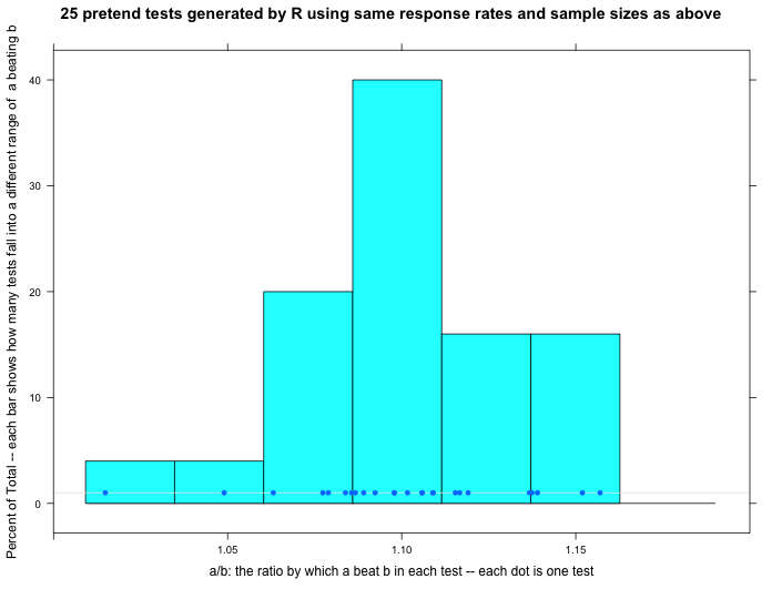
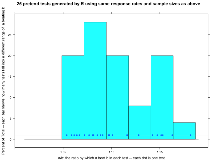
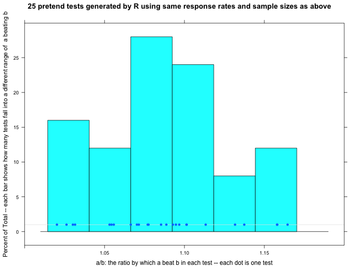
Even so, can we trust that our data is normally distributed? We think so, but we have some questions. Our response rates vary dramatically over the course of a 24-hour day (high in the day, low at night). Does that create problems for applying these statistical techniques? In this particular test, the response rate varies wildly from country to country — and there are dozens of countries thrown into this one test. Does that also cause problems? Tentatively, we don’t think so because the thing we’re measuring in the end — the percentage by which A beats B — doesn’t vary wildly by country or time of day…we think. But even if it did, since A is always up against B in the exact same set of countries and times, we think it shouldn’t matter. One little (or maybe big?) sign of hope is that the range of our real data approximately matches the ranges of the randomly generated normal data.
But those are a few of the assumptions we’re working to check. We’re always reaching out to people who can help us with our stats. We’re looking for people who are Phd level math or stats people who have direct experience with A/B testing or some kind of similar response phenomenon. Email fundraising@wikimedia.org with “Stats” in the subject line if you think you might be able to help, or know someone.
Zack Exley, Chief Revenue Officer, Wikimedia Foundation and Sahar Massachi
Can you help us translate this article?
In order for this article to reach as many people as possible we would like your help. Can you translate this article to get the message out?
Start translation