The key elements of the new design had been in public beta testing for many months, and hundreds of thousands of users had already adopted the new look. But, nothing compares to the real thing, and we tried to make the switch as painless as possible — by offering a quick way back to the old layout, by explaining our reasoning, observing and listening to comments carefully, fixing bugs and implementing changes quickly.
The single most frequently expressed concern about the changes we’ve made is the relocation of the search box from the left sidebar to the top right corner. This blog post will give an extended explanation of why we made the change, the other changes we made to the search, and what we’re planning to do next.
The old search box location
The default location of the search box in MediaWiki, the software used by Wikipedia, is below the “navigation” box in the top left corner. This was also the location in the English language Wikipedia, as well as many other language editions. Some language editions, including the German one, had customized the location of the search box, and moved it directly below the logo.


There are essentially three factors that influenced our decision to relocate the search box:
- common user expectations regarding the placement of the search box on web pages, as determined by the preexisting body of usability research;
- usability research regarding ideal search box width, and implications for the search box placement in our layout;
- ability of our test subjects to locate and use the Wikipedia search box, as determined by Wikimedia usability tests in a research lab.
There are several scientific studies that have examined the ideal placement of common objects on web pages. One early study by Michael Bernard conducted in 2001 by surveying participants regarding the expected placement of web objects such as internal links, external links, and search found that both new and experienced web users “generally expected internal search engines to be located in the upper and bottom-center of a web page. A smaller number expected it to be located at the top right of the page.”
This study was followed up five years later by A. Dawn Shaikh and Keisi Lenz (”Where’s the Search? Re-examining User Expectations of Web Objects”) in a survey of 142 participants. The study found that expectations had changed significantly, especially regarding the placement of the site search engine. The figure below illustrates the areas where participants expected the search to be found:
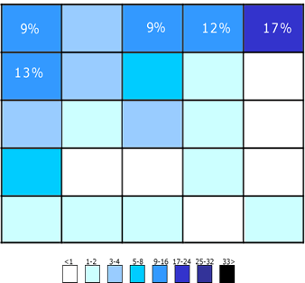
As the authors speculate and as seems intuitively plausible, early expectations of the placement of the search box were likely driven by the fact that search was commonly associated only with search engines of the time like AltaVista, not with site-specific searches. As more and more sites developed internal search functions, those were increasingly placed in slightly less exclusive screen real estate than the top center, shifting users’ expectations to look for search features in the top right corner.
Another factor that may have influenced user expectations is the common placement of search engine features in the top right corner of the web browser window.
There are practical advantages of positioning the search in the top right. As summarized in this research paper, several usability studies have pointed out a key advantage of navigational elements being placed on the right: it gives immediate access to the browser scrollbar. This is particularly valuable when a) scrolling up and down a list of search results, b) scrolling up and down an article you’ve just called up for information.
Search box width, and placement implications
The old search box is approximately 20 characters wide, the new search box accommodates 24 characters. More importantly, due to the placement of the old search box in the sidebar of the layout, widening the search was impossible without either relocating it or widening the sidebar.
The search box placement in the top right allows us to maintain a fixed standard width from one page to the next, while giving us maximum flexibility as to what that width should be. To make it even easier for users, we are experimenting with an expandable search, which is currently deployed in our sandbox 3. When you click the box, it will expand significantly to the left. We may or may not end up deploying this feature as we continue to look at ways to make search more accessible and user-friendly.

Our own research
In the course of the usability and user experience work since last year, we have so far completed a total of three usability studies, all of which are documented on the usability wiki:
- Usability and Experience Study (March 2009)
- Usability, Experience, and Progress Study (October 2009)
- Usability, Experience, and Evaluation Study (March 2010)
These studies included both remote and San Francisco based participants. While the primary focus of our studies were obstacles people encountered when editing, finding search in the navigation was clearly one of them, and our test subjects tended to resort to common web search engines to navigate Wikipedia instead of using the site’s own search. With the new search box placement, users’ ability to find and use the site search was markedly improved. One user intuitively used the search box in its new location and then consciously realized that it had been moved. To see videos of the other subjects finding and using the search box with ease, please see here.
For those unfamiliar with usability testing, it’s important to note that small samples and agile, iterative tests are commonly understood to be an effective method for discovering most key user interface issues. Our sample sizes were actually larger than strictly necessary, and more diverse than typical due to our use of remote testing methods.
With that said, we didn’t test the English Wikipedia against other languages which had placed the search box directly below the logo, and we recognize that this alternative placement is already an improvement to match user expectations. However, based on the cited research above, as well as the design reasons for moving the search box to the top right, we still believe that the overall case for moving the search is compelling even for those languages, if slightly less so.
So .. why did you move the search box? I liked it where it was!
In sum, we moved the search box to a) match web practices and user expectations, b) make it possible to widen it consistent with common usability recommendations, c) in response to actual observed problems of test subjects when using the old search.
We also recognize that millions of Wikipedia users had adjusted to the old placement, and will now have to re-adjust to the new placement. However, Wikipedia’s global audience grows by tens of millions of users every year (it is currently at 375 million unique visitors/month world-wide), and we hope to grow it by hundreds of millions in this decade. That will require that we adapt to common user expectations, rather than expecting every new user to adapt to us.
This will unfortunately inconvenience those who have adapted to the old placement. Do we absolutely know that to be the correct decision? No, but the fact that existing users are temporarily inconvenienced by it is not at all indicative that it is not.
Other search changes we made
It’s worth noting that the search box placement isn’t the only thing we changed about the search function. Perhaps most notably, the old search had two buttons (”Go” and “Search” in English). If you asked even an experienced user what the difference between those buttons was, you would get wildly different answers, and bug 577 had been open since 2004 because of this.
To answer the mystery: the “Go” button attempts to find an article with the same title as the entered search term and, if it fails, runs a full-text search of all articles. “Search” will always run the full-text search. “Search” is necessary where you want to search for a word instead of displaying the article of that title (say, you want to search for instances of “George W. Bush” all across Wikipedia).
In the new design, the less common case (search all across Wikipedia for a phrase, regardless of exact match) can be accessed using the “containing …” option in the drop-down menu. We believe this is both a more discoverable implementation, and it reduces overall clutter and complexity of the search.
Measures and coming changes
We are monitoring overall search volume. In the first week since the deployment, we have observed neither a statistically significant increase nor a decrease in search volume, but it’s too early to draw conclusions. There are also confounding variables. As noted above, the search box has changed not just in placement, but also in appearance and behavior. Finally, search volume isn’t the only interesting metric: search convenience (how long does it take users to, on average, find the search) is another one.
We’ll try to get our hands on solid metrics, but we’ll also continue to look for ways to make search more user-friendly (such as the auto-expansion), fix bugs, and so forth. In continuing our efforts to improve the user experience of all our projects, both for new and experienced users, we’ll try to share our thoughts with you frequently, and work with you to figure out the right answer. And, if you just can’t get used to the new search — you can always switch back to the old layout, which will continue to be there for you.
Warmly,
The User Experience Team
Can you help us translate this article?
In order for this article to reach as many people as possible we would like your help. Can you translate this article to get the message out?
Start translation